Three out of four people will decide if your business is worth their time based on how your website looks. Not what you sell. Not how good your service is. How the site looks.
That number comes up in study after study. And honestly, it checks out. Think about the last time you landed on a website that looked like it was built in 2012. Tiny fonts, cluttered layout, stock photos of people shaking hands. You hit the back button. Everyone does.
And here's what makes it worse. 94% of first impressions are design-related. People aren't reading your homepage copy and then deciding. They're glancing at the design for about half a second and making a gut call. Trust or no trust. Stay or leave.
If you're running a restaurant, a gym, a clinic, or any service-based business, your website is the one place where every potential customer ends up. They might find you on Google. They might see your Instagram. But before they call, they visit your site. And what they see in those first few seconds shapes everything that comes after.
What Makes a Website Look Untrustworthy
Let's start with the stuff that drives people away. Because most business owners don't know their site is doing this.
It loads too slowly
53% of mobile users abandon a site that takes longer than 3 seconds to load. Three seconds. That's it.
And every extra second costs you. A 1-second delay in page load drops conversions by about 7%. So if your site takes 5 seconds to load instead of 2, you're losing roughly 20% of the people who actually tried to visit you. They never saw your menu, your services, or your pricing. They just left.
The usual culprits? Huge uncompressed images. Cheap hosting. Too many plugins. A bloated template that loads 40 scripts on every page.
It doesn't work on phones
More than half of all web traffic is mobile now. If your site looks broken on a phone, that's the majority of your visitors having a bad experience. Text that's too small. Buttons too close together. Images that overflow the screen. Forms that are impossible to fill out with a thumb.
Google also uses mobile-first indexing, meaning the mobile version of your site is what Google judges for ranking. A bad mobile experience hurts your search visibility too.
There's no clear call to action
This one is shockingly common. 70% of small business websites lack a clear call to action. Think about that. Seven out of ten small business sites don't tell visitors what to do next.
No "Book Now" button. No "Call Us" in a visible spot. No "Get a Free Quote" form above the fold. The visitor arrives, looks around, doesn't know what to do, and leaves. You just lost a lead because your site didn't ask for the sale.
It's full of generic stock photos
You know the ones. The perfectly diverse group of people laughing around a conference table. The woman in a headset staring at a monitor. The handshake photo.
People spot stock photos instantly. And it makes your business feel fake. Like you're hiding something. Real photos of your actual business, your team, your food, your gym floor, those build trust. Stock photos destroy it.
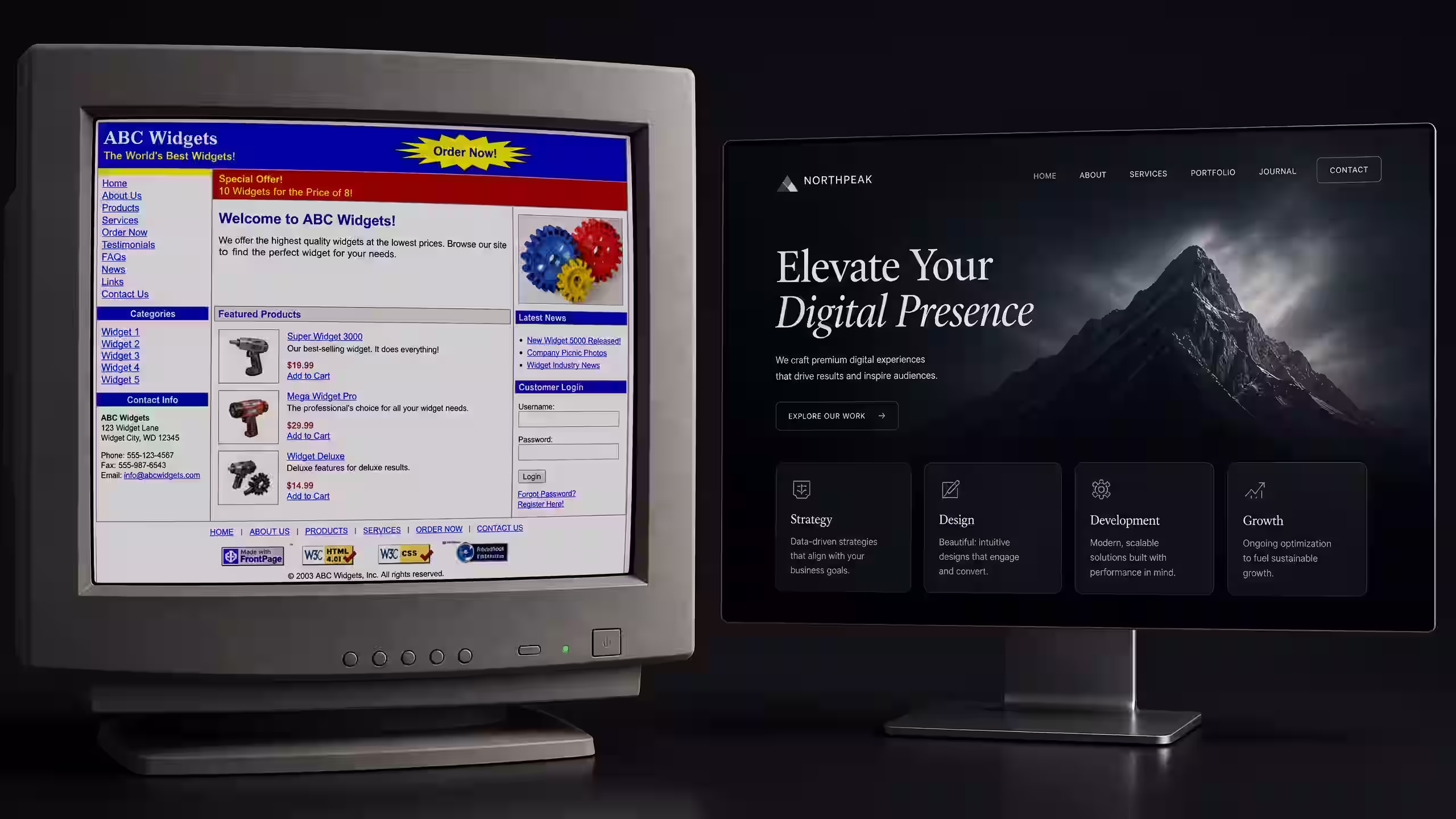
The design just looks old
Web design trends change. A site that looked fine in 2019 looks dated in 2025. Tiny text, cramped layouts, low-contrast colours, random font choices. These things signal to visitors that your business might also be behind the times. And if you're charging premium prices but your site looks budget, there's a disconnect that kills credibility fast.
What Makes a Website Actually Convert
Okay, so you know what's wrong. Now let's talk about what works. Because the gap between a website that sits there doing nothing and one that brings in leads every week is surprisingly small. It comes down to five things.
Speed matters more than you think
Your site needs to load in under 3 seconds. Ideally under 2. That means compressed images, clean code, fast hosting, and no unnecessary scripts. Google's Core Web Vitals test this. You can check your own site for free at PageSpeed Insights.
Speed isn't just about user experience. It's a ranking factor. Faster sites rank higher. They also convert better. It's one of those rare things where a single improvement helps everything.
Your value proposition needs to be above the fold
When someone lands on your homepage, they should know three things within 5 seconds. What you do. Who you do it for. And why they should care.
That's it. No long paragraphs. No mission statements. Just a clear headline, a short subtitle, and a button that tells them what to do next. Everything else goes below.
If a visitor has to scroll to figure out what your business does, you've already lost a chunk of them.
One CTA per section
Don't give people seven choices. Give them one. Every section of your page should have a single, clear action you want visitors to take. "Book a Free Call." "See Our Menu." "Get a Quote."
When you give people too many options, they choose none. That's not a guess. That's how decision fatigue works. One CTA per section. Make it obvious. Make it stand out.
Social proof goes right next to your claims
You say you're great at what you do. Cool. Everyone says that. The difference is backing it up right where people are making their decision.
Put testimonials next to your services. Put review scores next to your CTA. Show a case study result right after you describe what you offer. Social proof works hardest when it's positioned next to the claim it supports.
Great UX design compounds everything
Effective UX design can boost conversion rates by up to 400%. That's not a typo. 400%.
Good UX means intuitive navigation. It means the visitor always knows where they are and what to do next. It means forms that are short. Pages that aren't cluttered. A visual flow that guides the eye from headline to CTA without friction.
Most business owners think design is about making things pretty. It's not. It's about removing every possible reason for someone to leave without taking action.
Real Example: How We Built a Fitness Brand's Site and Got Enquiries in Week 1
We built a website for Fitness Solutions Co, a gym in Saudi Arabia that had zero online presence. No site. No search visibility. Just word of mouth.
Here's what we did:
- Above the fold: Clear headline explaining what the gym offers, a single "Book a Free Trial" button, and a real photo of the actual facility.
- Speed: The site loaded in 1.8 seconds on mobile. We used optimised images, clean HTML/CSS, and fast hosting.
- Social proof: Member testimonials placed right next to the class descriptions. Before-and-after transformation photos where they mattered most.
- Mobile-first: Designed for phones first, then scaled up. Every button was thumb-friendly. The "Call Now" button was sticky on mobile.
- Local SEO: We set up their Google Business Profile at the same time and linked it to the site. Both reinforced each other.
The result? Enquiries started coming in during the first week. Not month. Week. People were searching for gyms in their area, finding the site, and contacting the business directly. That's what a properly built website does.
You can read the full case study here.
DIY Website Builders vs Custom-Built: When Each Makes Sense
This is a question we get constantly. "Should I just use Wix?" Or Squarespace. Or WordPress with a template.
Here's the honest answer. It depends on where your business is.
When a DIY builder works fine
If you're just starting out, have a tight budget, and need something simple, a DIY builder is fine. Squarespace and Wix can produce clean-looking sites without code. They handle hosting, security, and basic SEO for you.
The catch is that you're limited. Templates look like templates. Customisation has a ceiling. Page speed is often mediocre because you can't control the underlying code. And if you ever want to move your site off the platform, it's usually a nightmare.
But if you need a basic 3-page site that says "here's who we are, here's what we do, here's how to contact us," a DIY builder gets the job done for $15 to $40 a month.
When you need a custom-built site
If your website is a lead generation tool, not just a digital business card, you need a custom build. Here's when it makes sense:
- You want the site to rank on Google for specific keywords
- You need fast load times (under 2 seconds)
- Your business has specific functionality needs (booking systems, client portals, calculators)
- You want a design that doesn't look like 10,000 other sites using the same template
- You're spending money on ads and need landing pages that convert
A custom site costs more upfront. Usually $1,500 to $5,000 for a solid business site. But it pays for itself through better rankings, faster load times, higher conversions, and a design that actually reflects your brand.
Think of it this way. If you're spending $500 a month on Google Ads and sending that traffic to a slow site with no CTA, you're wasting most of that ad budget. The website is where the conversion happens. Investing in a good one is the highest-ROI move you can make.
The Real Cost of a Bad Website
Let's put some numbers to this.
Say your site gets 500 visitors a month. Pretty typical for a local business. If your site converts at 1% (which is common for poorly built sites), that's 5 leads a month. A well-built site with clear CTAs, fast loading, and proper design can convert at 3-5%. That's 15 to 25 leads from the same traffic.
You didn't spend more on ads. You didn't post more on social media. You just fixed the website. And tripled your results.
Now multiply that by the average value of a customer. For a restaurant, that might be $30 per visit with repeat business. For a gym, $50 a month for 12 months. For a B2B service, thousands of dollars per contract. The math is obvious.
A bad website doesn't just look bad. It costs you real money every single day.
Frequently Asked Questions
How much does a professional business website cost?
A standard 5 to 8 page business website costs between $1,500 and $3,000. E-commerce or custom web apps run $5,000 to $10,000+. Most businesses recoup the investment within 3 to 6 months through increased leads and sales.
Can I build my own website instead of hiring a professional?
Yes. DIY builders like Wix and Squarespace work well for simple sites. But if you need fast load times, custom functionality, or conversion-focused design, a professionally built site will outperform a template every time. Remember, 75% of users judge credibility by design.
How long does it take to build a website that actually converts?
A standard business website takes 2 to 4 weeks from kickoff to launch. That includes planning, design, development, and testing. The key is getting the strategy right first, because fixing the wrong structure later costs more than doing it right from the start.
What To Do Next
Look, if you've read this far, you already know something's off with your site. Maybe it's slow. Maybe the design is outdated. Maybe there's no CTA and you're not sure how many leads you're losing because of it.
Here are two things you can do right now:
- See how we build websites. We'll walk you through our process, timeline, and what you get. No fluff, just the specifics.
- Book a free strategy call. We'll look at your current site, tell you exactly what's working and what isn't, and give you a plan. No obligation. No sales pitch. Just honest feedback.
Your website is working right now. The question is whether it's working for you or against you.